Here you can see after we'd laid out our final cut visuals we went on to colour correcting some of the shots. It was only a handful of shots that needed this done to them, but those that did proved to be quite a problem. The main problem was that for the opening split screen shot of the title, since we had 3 shots of it we cut to and from and they all looked quite drastically different. I managed to change one to match another but the one screenshotted on the right, below was impossible to match because it is such a warm image and everything I did even messing with the levels meant that if one colour got closer it ruined the rest of the image. Begrudgingly we had to leave it, 2 fitted relatively well but the warm image was impossible to match up visually. This problem was probably because we had to set up all these shots very quickly as we didn't want to waste anyone's time in the workshop, as a result the 3 cameras would all have been filming on different settings. Normally everyone checked their cameras were the same, but we didn't have time here.
 |
| Here I tried to make it colder to fit visually with the next shot. You can see here I did this by playing with the levels on fcp. |
 |
| Using the 3 way colour corrector wheels to try and pull out the green tones from this shot. |
 |
| The shot it cuts too is a lot warmer, and looks very different |
 |
| The much brighter shot of the title |
We decided not to keep the split screen going or bring it back in again because it would have felt like a strange motif that we weren't quite sticking with, it would feel like a half done idea. I like it in the way it just throws you into the film with a lot of movement straight away, and gets you immediately involved, but we didn't think it would work again after we get into the story a bit more.
Also after messing around with colours we also darkened the below image to silhouette the graffiti writer. As per all the films I've seen researching this project pretty much all the graffiti documentaries feature people doing actual graffiti, it's an essential element. Despite not having much footage of that nature we tried to make this one really stand out by bringing out the colours in the foreground and silhouetting the person by darkening the dark textures and upping the contrast, I think it looks really good and people that have viewed the film have commented on it showing I think we achieved what we wanted.


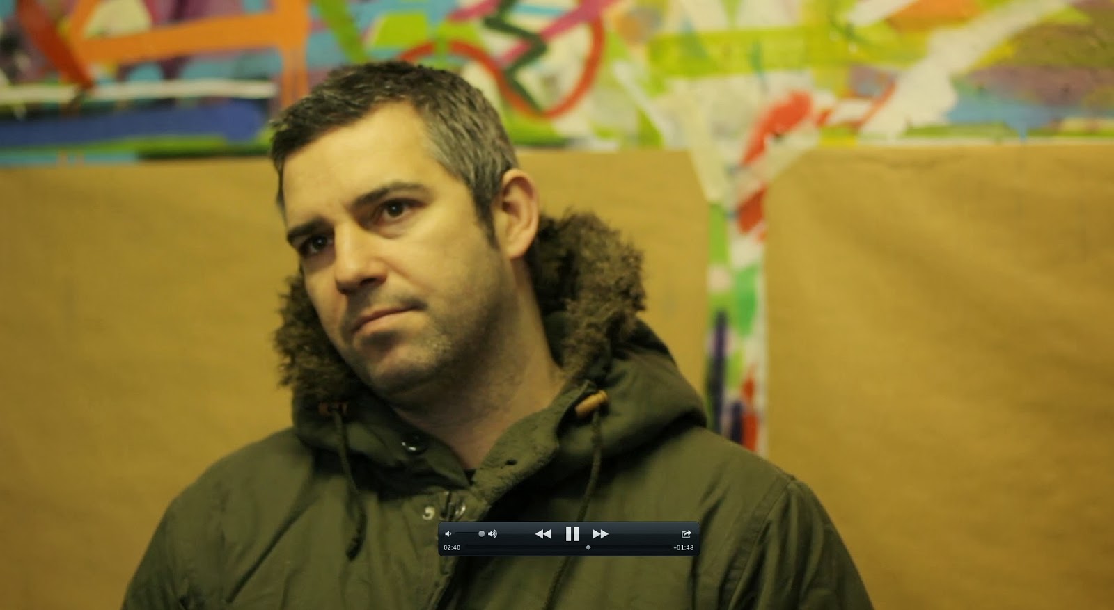
The below screenshot is my attempt at following Lee's advice about putting little things in to make it not seem like it was just formal rigid interviews. Phillip here looks directly down the camera for a brief second, but it's still noticeable and I think works in the way Lee was trying to explain, albeit in quite a minor way. I felt like this is something I should have done more, but the interview clips I used didn't really have too much like this within them so putting it in would have been ruined the structure we established, but I tried where I could.

The new ending to the film is much more light hearted and intended to make people laugh, so for this we decided to just hold the interview on screen for a longer time, the longest we leave anyone on screen in the film. This doesn't matter though because even if it begins to outstay its welcome it ends quite unexpected and funny, it gives a bit of relief from what could maybe be seen as a the film preaching the positives of street art a bit too much. What I regret doing is the cut to black right after that, it feels too harsh in my eyes and I wish I'd experimented with how to end it more. I kept it as a cut because the rest of our transitions were just cuts, as I wanted to go for a sort of raw seeming cut structure, dissolves and fades/wipes looked awful when I tried them out early in the edit. I was more for keeping transitions consistent throughout the film, as whenever I strayed from that idea I couldn't get them to work and look good.
 |
| The held end shot before cutting to black and then the credits. |
I also taught myself to make the background to the text since alone it didn't look very good and seemed out of place when it was just alone. I did it by adding a black screen in to the scene, changing it's opacity to about 60% so you could still see through it. I then cropped it and moved it using the 'centre point' to cover the text, then finally to make the text stand out more I upped the contrast on it for it to be as clear as possible to give people the best chance to read it and potentially get over that problem.
 |
| Adding the text to the image and getting it nicely in the corner so its visually pleasing and not blocking the subject. |
 |
| Here you can see me resizing the rectangle to fit around the text, and feathering the edge so it's not so harsh. |
 |
| The same font used in the quotes for visual symmetry throughout the piece. |
 |
| The good effect of the finalised text with background. |
 |
| The final cut structure without the soundtrack on. The silent bit at the start is where Oli's soundtrack will run most prominently then he'll lower the levels throughout the interviews, kicking it back in in the gaps. |