Thursday, 8 May 2014

Interior Scenes Footage Review

After shooting the interior scenes I got a copy of the footage so I too could check that all the footage looked alright and we could decide we didn't need a reshoot. Our second shooting day locations was very close to the first day location so if needs be we could easily redo some parts.


Here in one of the opening shots we wanted to clearly and quickly establish that the character is very artistic and creative, so I introduced her in the background, while the drawings and drawing equipment was very much in focus in the foreground. Thus we immediately know that drawing herself is an important aspect of her life.


This again is shown in a shot later which you can see here where I focus pulled from Lucy onto her drawing to show the audience what she's doing and to show everyone how she passes her time-in an imaginary world. The pens again are still prominent in frame to emphasise this further.


This is a shot from later in the scene but I still played on the idea of focus pulling from the pens to Lucy to show her creative side. I wanted to keep this visual motif running. If anything I think here I made it a bit too obvious and it could have done with being more subliminal.

Another visual thing I thing I tried to keep going was putting Lucy in the centre of the frame since it partly mirrored the idea of video games where your character is always (generally) in the centre of the screen. This furthermore gets across the idea of living in different worlds etc and on a different level looks visually very good. This shot in particular looks quite dreamy with the lighting in front being very bright. A good example of the amount of light the window let into the room.


Here again you can see how I framed Lucy in the centre, here again I think it looks very good and we wanted the drawings to engulf her and frame her to show how they are an integral part of her life. I especially like the lower angle shot of her, from a low angle you get the impression of greatness. Also for that shot I used the 24mm so that it distorts a bit and looks like it pops slightly in the middle, a very subtle thing, but an extra level nonetheless. Looking back I wish we held these shots for longer I think it would have been more mature filmmaking, but we were going for a bit more of an energetic feel so insert shots and cuts fit more than a long held shot. This also shows a clear influence from Super, something I planned on in my analysis of the final scene of the film.

In this shot we wanted to try and do a bit of framing to experiment a bit more. I think visually it worked very well as you can see here, it is a busy and relatively interesting frame but the problem is that it is not really beneficial to the story at all. It looks good but doesn't bring anything much to the story beyond putting the camera in a room so understanding a bit more about the architecture of the location.

Here is a close up meant to be a similar but closer version of the previous shot but here the huge window got in the way. There was so much light coming through it made Lucy a silhouette pretty much making this shot useless. It still looks interesting but doesn't fit with the rest of the shots.

Here is an example of one the close ups we did of Lucy with the 50mm. Like my tests it worked very well, the proportions look good and there is enough of the background to fill the frame interestingly but not too much.


Here are another couple of 50mm close ups, again they both look good and are framed quite well. The door handle was in a different part of the house where it didn't get much light so it is a different colour but the colour still does strangely compliment the light shade of all the other shots. Colour correction would be pointless due to how different they are but I don't think it's too much of a problem since the shot its self isn't particularly essential to the continuity of the scene. 


Here you can see how I created a sort of visual metaphor for Lucy's feelings to the drawings. The left photo is when she has just put the photo up on the wall, as a result she is still confident in herself and is very close to the drawing, she feels very connected to it. As a result I used the 50mm to make sure we got in close to really appreciate it and get this feeling. The right photo is after she has given up on her super hero esque dreams and has ripped down all the paintings, since she is so unconnected with all her past dreams she is now standing a lot further back to look at where her wall just was. Consequently I moved further back with the camera to exemplify this and make it very clear to the audience, it seems more like we're observing her in this shot compared to the left shot where it feels like we're more involved with her and the scene. This again shows the power of using an immersive 50mm to connect with a scene more or a 24mm to make it seem more objective and like we're watching someone rather than engaging with them.
This again is partly reference to Super as the importance and personal feel of the story partly came from the drawings being seen clearly, something done in the left shot here. We also panned over the images though since they are just black and white line drawings (due to them meant to be doodles) it wasn't as colourful so not quite as interesting and visually outstanding.

Overall I'm quite happy with all the footage and  the shots seem to be of good quality and there seems to be enough to not need a re-shoot.

Analysis of 'The Raid' Fight Scene Dir. Gareth Evans

What is first most noticeable when analysing the fight between the two brothers (Rama and Andi) and Mad Dog is the intricacy in which it is edited. Since in the 7 min long scene there are hundreds of individual cuts to make the scene make sense visually and to make sure you know in the cinematic landscape where all the characters are. Some of the effect of the scene is down to the sheer length of it, as mentioned it's about 7 mins of constant non-stop fighting, all extremely well choreographed and as good at it is as a film this scene also benefits from being a master class example of the type of martial arts they're doing.

One of the grapples involving all three actors in frame.
At all times the fighting is on screen and is seen to be realistic due to the angles in which it is shot from. Positioning seems to be key to not only to make the punches look like they connected but also for the reaction from the victim of the hit to seem most realistic too.

Here you can see Mad Dog recoiling from a kick to make it look more real.
This is partly down to the cinematographers Matt Flannery and Dimas Imam Subhono opted for a very handheld feeling to the sequence, this gets across the raw, brutish feel to the fight. It's kinetic and its visceral and the handheld camera shows this very well. Even when a few punches connect the camera jolts as if it too is being hit by the impact. This idea of making the camera reflect the action is extremely key to making this sequence work as well as it does and is something I will definitely try to emulate when I shoot our fight sequences. This handheld aspect is something I think I could best achieve using the shoulder rig, but with more movement around the fight to exemplify the energetic feel.

Utilising the environment they're in and involving things around them.
The cuts are quick as well as plentiful showing that each shot has been shot multiple times from multiple angles, to give the editor as much leeway as possible when it comes to cutting and keeping the fast pace of the action maintained. This is something again I'll definitely take to heart when I'm on set of our film, like our indoor scenes we will want to shoot each aspect 2/3 times to make sure Tom has enough to work with when he gets editing. This may vary on the day though as the shoot will be much more physical we don't want to tire out the actors so they're visually fatigued by the end of the day, we will have to take notice of how they're doing too.

Here Mad Dog and Rama have framed Andi so the audience knows where he is still within the scene, while the action continues.
What's noticeable is that for a lot of the fight there isn't any visual damage to the actors this is probably a practical decision since it means they will be able to shoot any part of the fight scene again if they needed to without having to get the actors in and our of make-up. This isn't a problem we're going to encounter on our film because we won't really use and make-up in our production, the punches will mainly be to the torso so wouldn't cause blood and a lot of the kicks/punches are dodged.

A rare single close up of Mad Dog to briefly delay the action for it to build up all over again.
There is a repetitive pulsating score running throughout the scene too, what is most noticeable and best about this is that it reacts to the fight. For example it stops slightly when no one is hitting and are just getting their breath and it skips slightly occasionally if there is a particularly hard kick/punch, this sort of visible and audible synchronicity is one of the ways the scene comes across as so outstanding and so well crafted.

An exmaple of both the clear colour scheme (exemplified by all the other images too) and how later in the fight blood becomes more clear on the actors, seen slightly here despite being a bit blurry.
The colour scheme of the scene is very consistent of grey-y blues it gives it a sort of visual cohesion that keeps it aesthetically pleasing to look at. This is helped by the fact it is an indoor scene so that can be controlled much more.

Here you can see how it's developed into using weapons to finish the battle.
The final thing noticeable about the fight is how it builds as it goes, it starts of as very pristine clearly choreographed fighting then as it goes on it gets more brutish and though still immaculately choreographed it seems more sloppy. Finally it goes onto to ending the fight using weapons, this sort of build seems like a very natural progression for the situation and therefore makes sense and is something I think we should emulate in our sequence.

My notes from watching the scene

Shooting Day 1

The start if our first day of shooting began with me and Tom meeting the actor, Lucy and getting to know her a bit so there could be more of a fun and friendly atmosphere on set. Unfortunately in the rush of getting to the location since I had all the equipment at my accommodation I actually forgot the tripod, which obviously meant we couldn't use the dolly track either. This was a bit of a set back however we had the shoulder rig meaning that if it was set stable enough we could still get good static shots. The shoulder rig meant we had a nice handheld feel to it though without it being too shaky, more smooth handheld feel. This obviously wasn't ideal but we made the best of the situation.  In the more ideally static shots it wasn't too bad either as long as I set myself in a good fixed position they stayed relatively still.

The camera on the shoulder rig, with the 50mm.
One of the problems encountered was the fact the scene was set next to a large window which emitted a lot more light than I first had imagined. This as a result meant as the sun went behind clouds etc the lighting changed. It was never drastic but I thought it might have been a bit noticeable, however I set the exposure to a set amount so that it was consistent, if I kept changing it then it would have been more of a problem as far as I was concerned and colour correction in post would have been more of a nightmare. I made it so if anything the scene would be too bright, I thought that if this were too happen a lighter image look would get across a more dream like or maybe fantasy idea as opposed to it being under exposed which would have made it seem a lot more brooding, not a mood we were going for in the film. 

Lucy's desk
The sun remained the same brightness however and it didn't get any visually warmer or anything, to make sure we were safe I took a few white balances throughout the day, but it seemed good looking at the display and reviewing a few of the clips when importing it to the computers. 

Here you can see how the light is strong in the background
but not too much to ruin the shot. 
I used all the lenses bar the 85mm. I hadn't anticipated the exact size of the location and when we got there and started it quickly became apparent the 85 would have been better in a bigger location, you needed to be more at distance to get the good shot, and the couple we did line up with the 85 looked a lot better and were much easier to do with the 50mm. The 50mm we used for close ups and insert shots predominantly, but it was very good at that. The only problem I got from that was that the focus depth of field was so bare in a few of the shots where Lucy moved we had to do them a couple of times as it was hard to keep focus, after a couple of attempts though it was pretty good. The 18-55 was used more for the wide angles and was probably the most used lens. 

One of the shots I used to custom white balance
We did about 3/4 takes of each shot to make sure we got it right or had enough to work with to edit it to work in some way for it to work. Where possible we did it from a few different angles too so we had elbow room to play around a bit in the edit. We always used the same lens though, there was talk of trying shots with a couple of different lenses but that would have been too much of a stark change to just cut to, for the continuity of the shot, otherwise it would have looked awful to cut between them.
Test shot for one of the scenes

The storyboards and shot lists proved rather invaluable, and we're always a great point of reference to go back to if we got a bit stuck. It also meant we could tick them off as we went so we knew what we had without having to trawl through the shots in the camera individually. This is something I'd not done properly in my other projects so it was a relative god send having something to refer to and is something I'll definitely focus a lot more time on next project. 
The doodle wall set up

It was just me Tom and Connor at the shoot, no one else could make it for various reasons, so Tom stepped in as sound recordist. It worked out having fewer people on set too due to not having a huge location to shoot in, it meant we could all move easily and there was no risk of people getting into shot. The only problem this presented was that me and Tom had to bring all the equipment to the location just between us two, which was a pain, but bearable. 

At the end if the day we also recorded the monologue over the top of the scene while I got some insert shots of the games provided my Tom and drawings provided by me and Connor. My drawings were much worse than Connors due to my lack of artistic ability, but this worked as sort of a comedy moment so I made sure the contrast of the photos was in shot. Little moments of comedy are something quite big in comic book films nowadays and this worked out to be our own little subtle way of doing it as the idea is tenuously based on comic book films but not overtly. 

Most of the shots were quite stationary and fairly simplistic pans, focus pulls etc. We just wanted to make sure we had plenty of them so we not only would have enough for the story to work but enough to be able to drag out the sequence or cut it to last less time so we can hit the 5 min specification in the brief. 

What was also helpful about the day shooting was that the location was so close to the second location where we were going to shoot the fight scenes so we went down there and scouted it out allowing us to plan a bit more for the bigger shooting day.
Shot from the location recce for the second day shooting
The team selfie for day 1 of the shoot.

Shooting Day 1 Pre Production

We set the day Sunday 6th April as our first day of shooting where we planned to try and get all the interior scenes done. I nominated myself to book all the equipment for this day then transport it up with the rest of the crew. 


I'd seen pictures of the location from Conor and the ones in our presentation so I did what we tried out in one of our production skills seminars and drew a basic layout of how I expected the scene to be laid out. Over that I marked where I imagined the best shots to be coming from, so that when we were there we didn't waste a long time discussing where to shoot it from, I would know where I wanted it and Conor would know where he did so we decided between us which would be better or tried both if it was easy and quick to do. There wasn't too many locations Lucy would actually be moving so there weren't too many set ups. Conor lived in the location so had a very strong idea of what would look best, as a result we didn't feel the need for the rest of us to do a recce of the location.
Photo's of the location I'd seen:


 My scene layout:


Also here you can see I wrote out two slightly different shot lists and showed Conor in our meeting beforehand. I wanted to think of a couple of ways we could do it so we could shoot them to give us elbow room in the edit if one lasted longer or looked better.


Conor had too made some storyboards based on his idea so we had a lot if ideas to try and experiment with to get what we needed on the day. This also meant feeding and bouncing ideas off each other could make the best of both our visions. 


I also drew some drawings to put up on Lucy's creative wall that was quite a big part of the film. They were of sort of super hero esque scenarios to fit in with the sort of things I thought Lucy would have drawn if she daydreamed of being a sort of hero, part of the premise of the film. The important drawings however were drawn by Conor who can actually draw so looked good. They were all just pen without any colour because of the idea they were meant to just be doodles that she does when she's daydreaming.

My drawings for the wall:


The main drawing for the story:


We decided not to use any lights because it wouldn't have made a great deal of difference to the story, also the window provided a great amount of light that illuminated the scene enough according to Conor. I didn't push for lights because I watched an interview with late cinematographer Harris Savides who said when he lights he lights the scene rather than the shot because 'no one is going around your house lighting you'. This is something I liked as an idea and I felt applied here, we didn't need them overtly so it would've been a waste to unnecessarily use them. 

In our meeting before we met up to shoot we pretty much just summarised everything to make sure we were all clued in about what was happening, when where, which tram to get etc. 

Analysis of 'Super' Dir: James Gunn

In preparation for the flat scene I re-watched the final scene from Super, a scene that I thought was trying to get across similar messages to what we were and a film that does it in a very stylish and visually pleasing way, something I could get inspired from. This is because the film gets across a lot of emotional effect through a variety of ways, and all in a sequence that only lasts about 1 min 30secs.


One of the ways they do this is simply through the acting. It may sound stupid but up until analysing this sequence I hadn't considered showing the actors enough for them to get across their own emotion, I'd just been considering stylistic ways in which to create an emotion through the camera angles etc. The emotion in this scene it could be argued is mainly because of Rainn Wilson's acting, sometimes it doesn't take anything too stylistic to create a mood, rather you can just go to a basic close up and let the actor do the work. Though it would be foolish to rely on this. I think the key to getting a good scene is to get a balance between this and an interesting camera work, something this scene and indeed this film as a whole does well.
Another main way this scene gains emotion is through the score, and if anything I think it relies much too heavily on it. The music is very typical uplifting but emotional and I think if it was not in the scene the sequence would be much more void of emotion than it is with it in. Again this exemplifies how every aspect makes emotion in a scene though and its how they interplay with one another that gives a scene some memorability.
There is also voice-over to the scene to basically wrap it up, something I'm not particularly a fan of but since it is used in moderation and is cut down to all that needs to be said it actually works quite well at tying up the story. I don't want to use voice-over in ours if we can help it, I think it would be much more of a feat to achieve a whole story with minimalist or no dialogue.

Here you can see Rainn Wilson crying to get across a personal emotion.
One of the shots that stands out in this sequence is when we cut to behind Frank to view all the drawings he's received. This plays a part in the story so by the end when we see them all we feel happy for this character we've learnt to sympathise with. The camera work is very clever here since we first cut to quite a closed shot of Frank looking at all the drawings then as we slowly zoom out it reveals the rest of the scene showing how the walls are consumed with these drawings as Frank sits fixated on them. By cutting between a shot in front and behind him we begin to piece together how much they mean to him since we see his reaction in the front shots and then the scene in the behind, this simple cut to both sides works to great effect.
The shots of the drawings on the wall behind him are beautiful at showing the scene in a single image, it would have worked even without reaction shots. This shot of the drawings surrounding the subject is one I think we'll definitely try to get whilst shooting our scenes.

Showing the drawings engulfing the walls. I also like how Frank is framed slightly off centre, its a slight touch but is unexpected and makes the frame a bit more interesting.

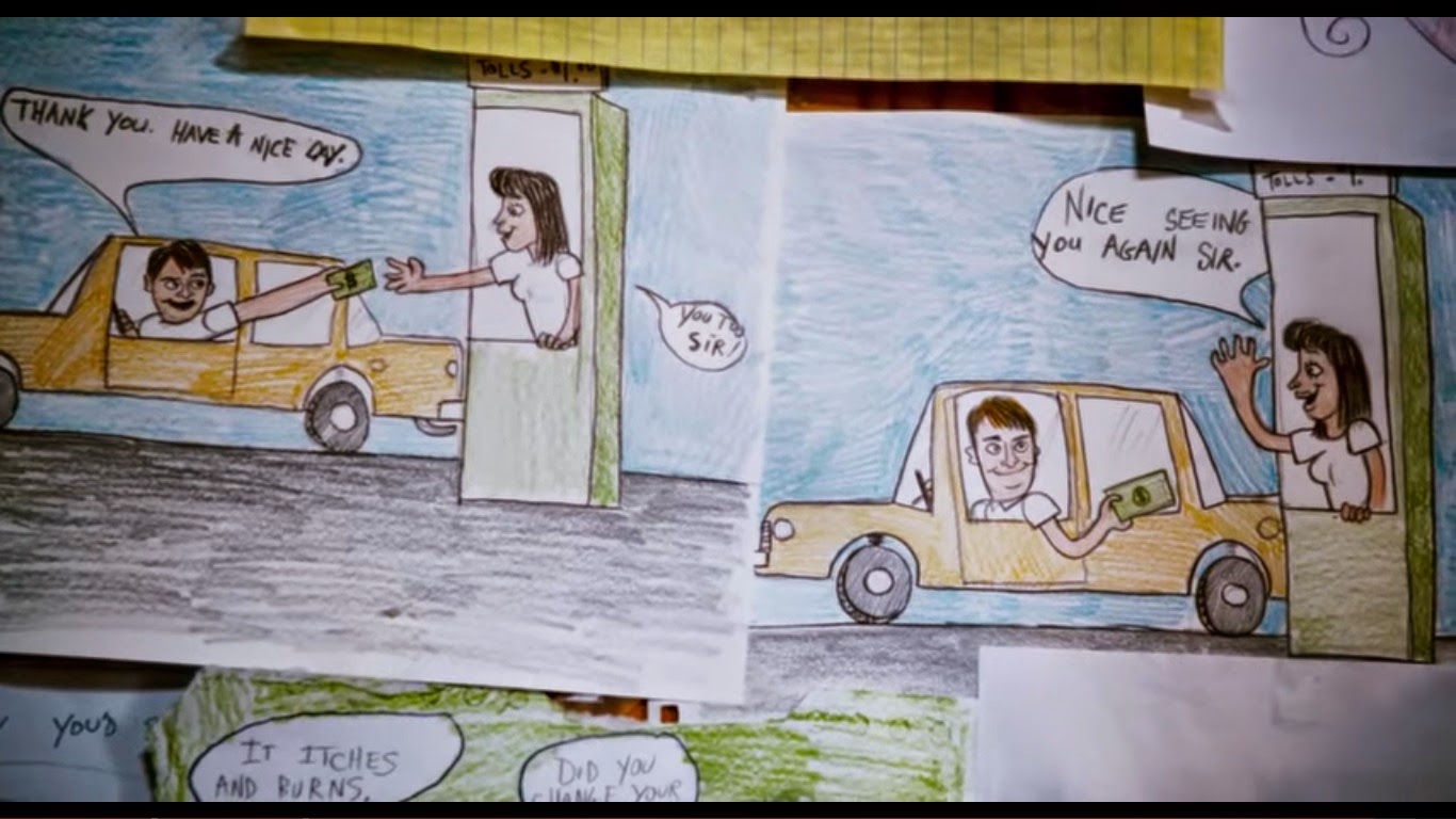
To furthermore get a feeling and connection to the actual scene it cuts to panning close ups of the wall of drawings so you get to see them in detail. This makes the whole wall feel much more personal since you know that each one of the drawings has a story to it, so when we again see the whole wall we appreciate it more. Some of the drawings also replicate things/moments from the film its self which gives the story a nice full circle feel. The colour of them all makes them outstanding and interesting to look at and explore too.

Example of the brief childish colourful stories on one part of the wall.

These two photos show how the drawings actually reflect the real world of the film, as both show Frank and his rabbit.


Overall I think this scene is executed well, and it is showing something similar to what we want to in our interior scenes, so I will take a lot of influence from this. This will mainly be visual influences I reckon in terms of good ways to show the drawings on the walls and engage with the scene and character.

My notes from watching the scene